Problem:
The energy drink market is saturated with aggressive and visually overcrowded brand identities. The challenge was to create a brand that would stand out through strong yet controlled visual communication, while developing packaging that appeals to younger audiences and creatives without relying on industry clichés.
Solution:
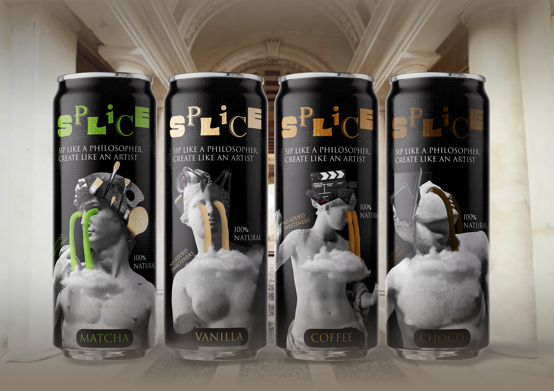
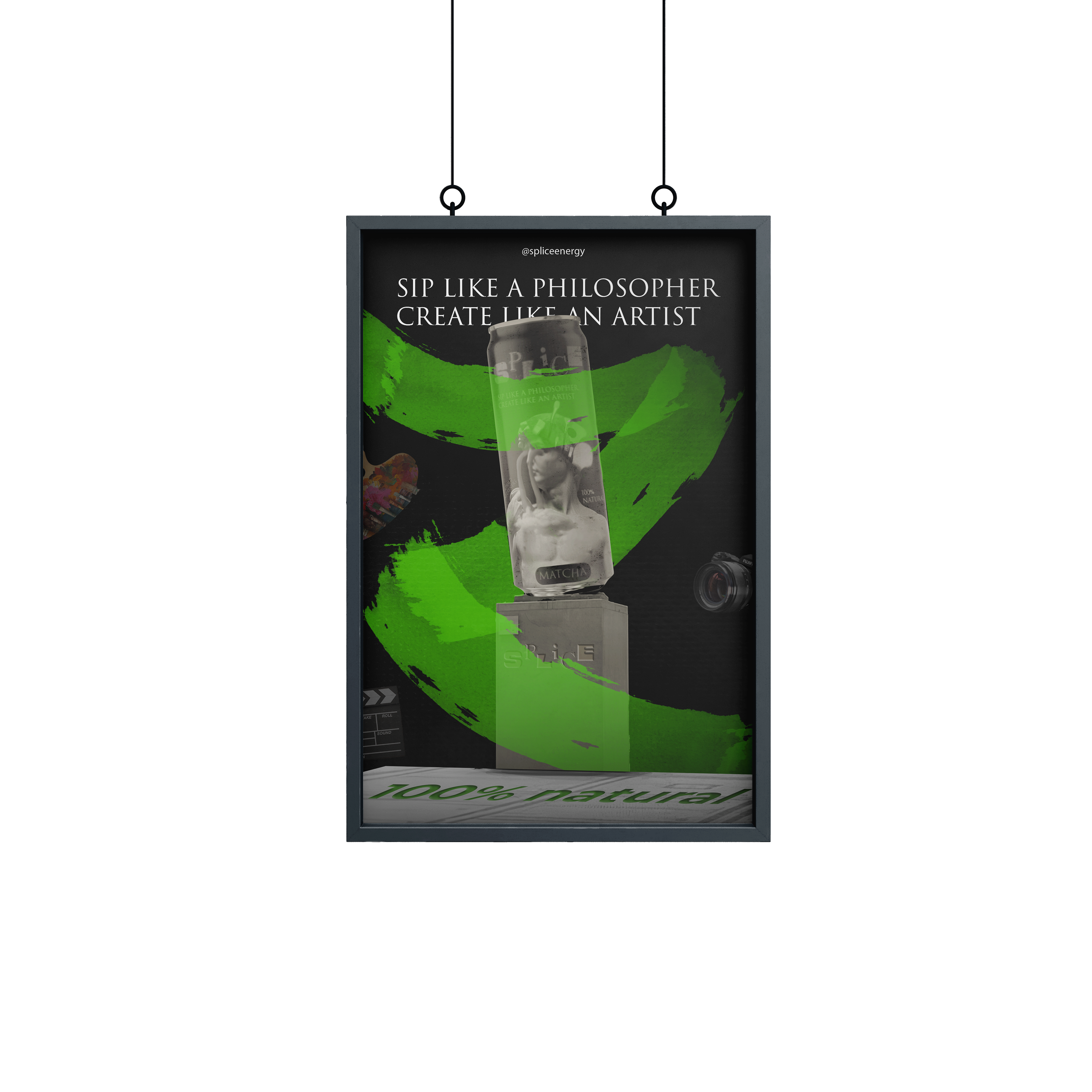
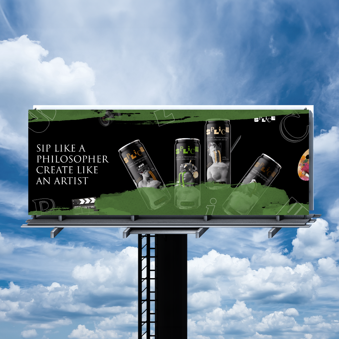
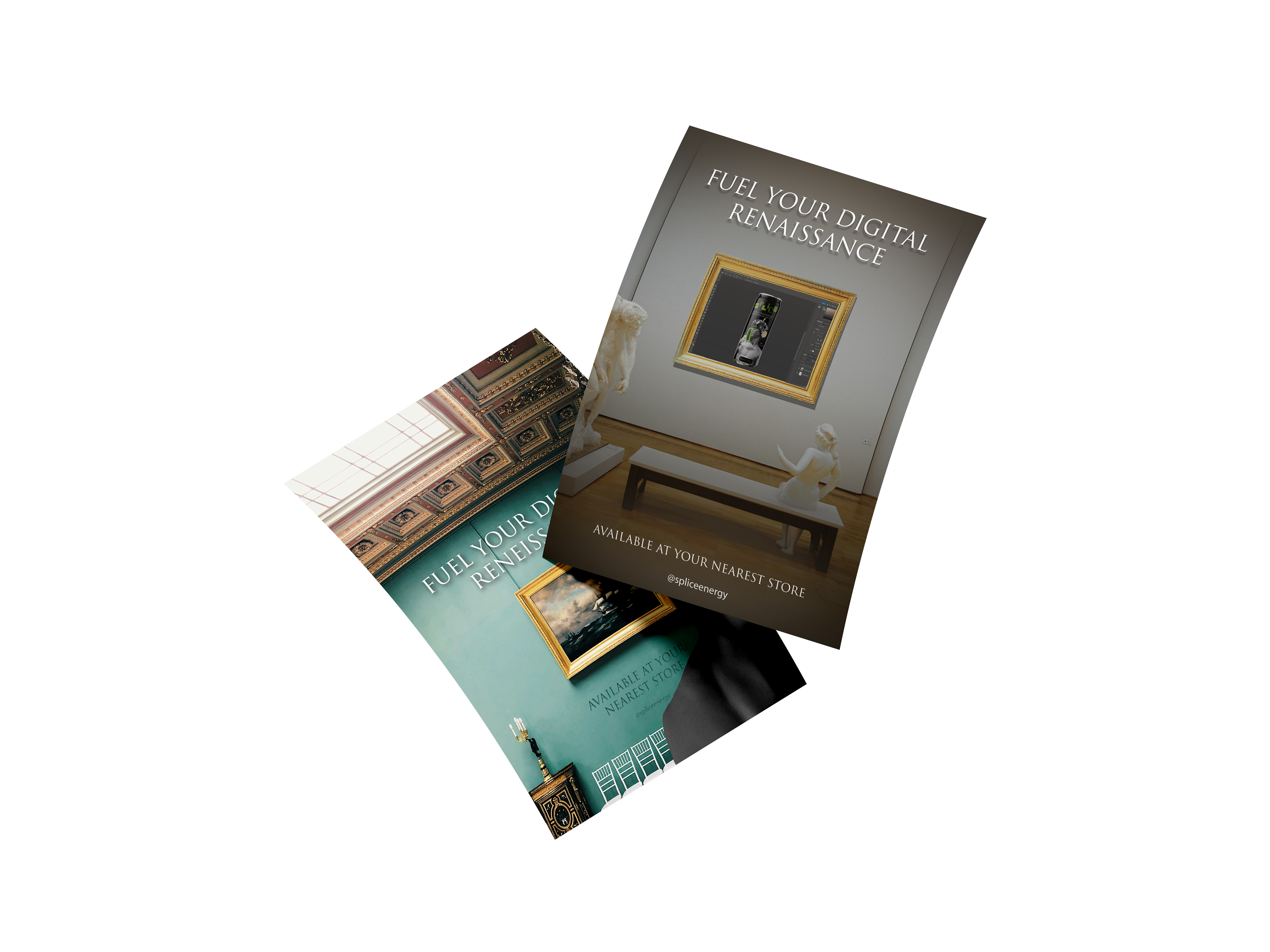
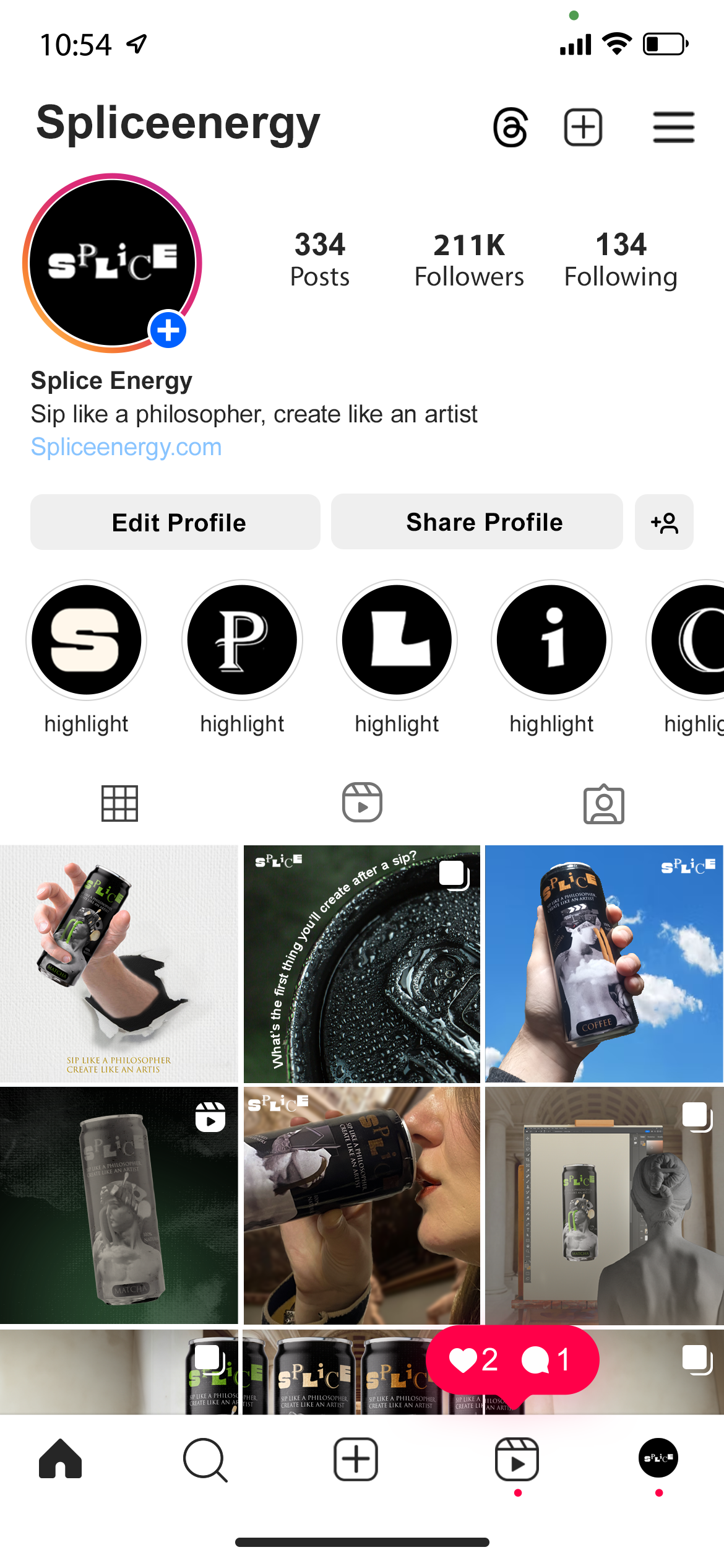
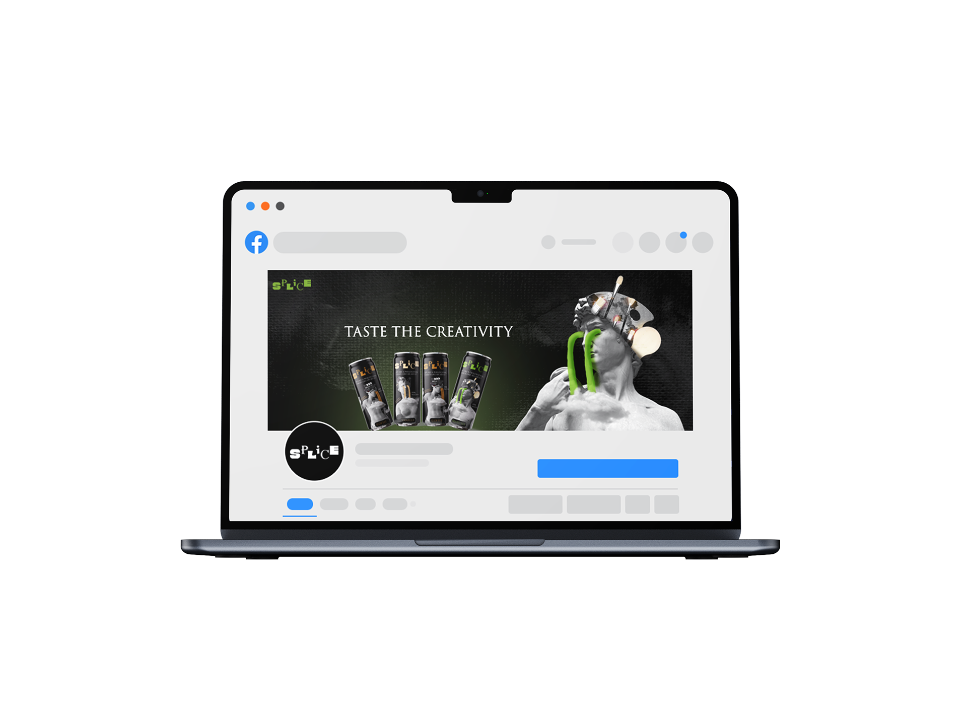
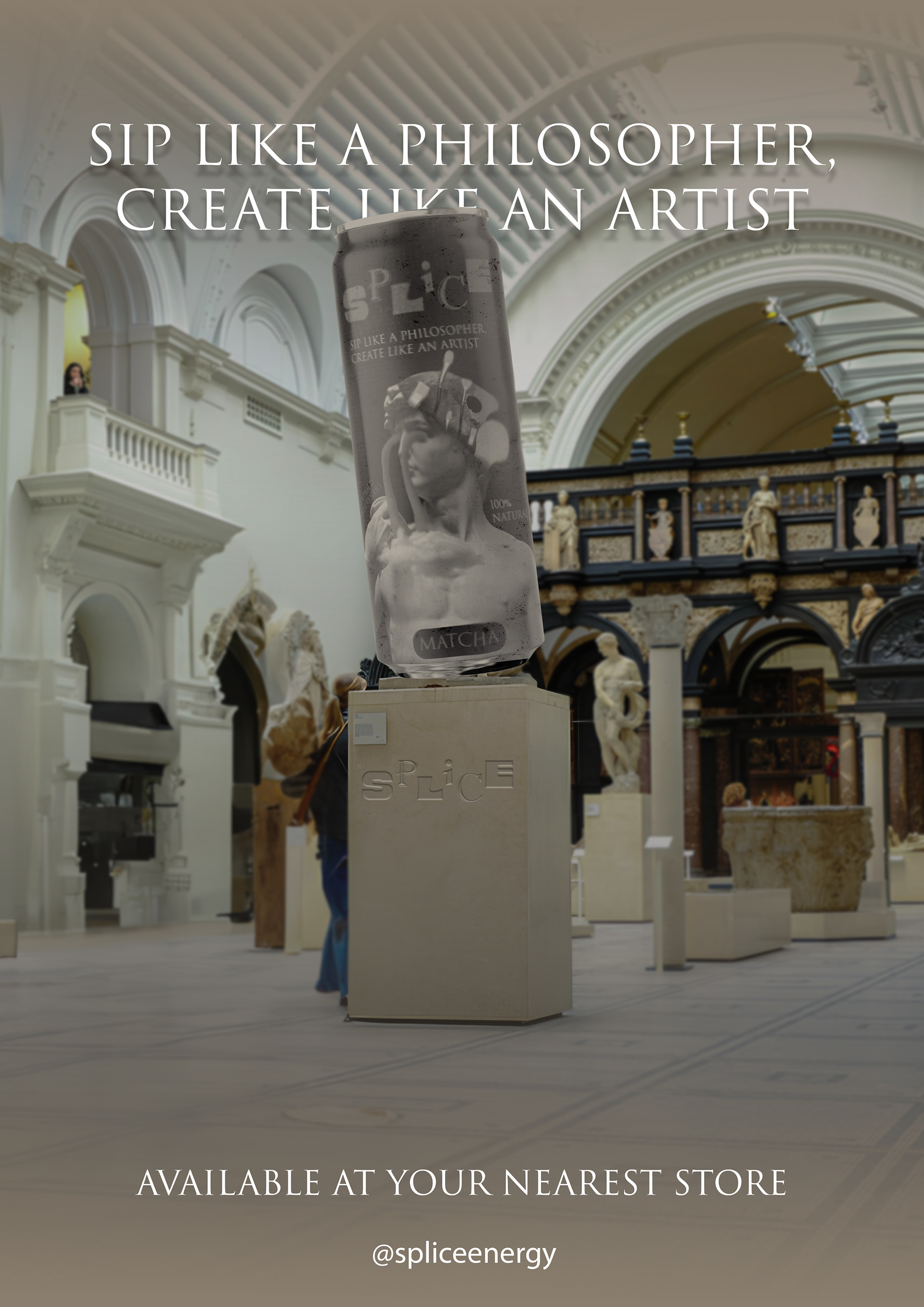
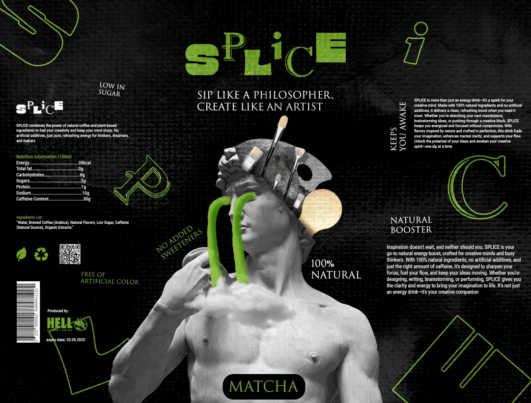
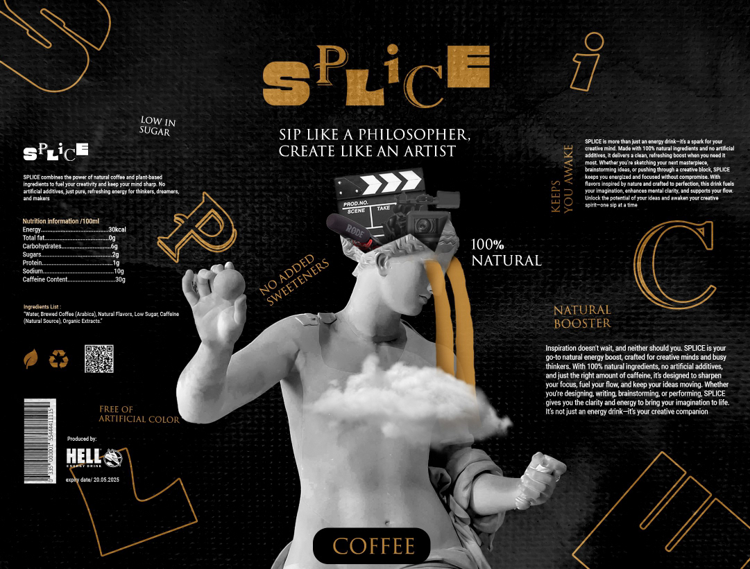
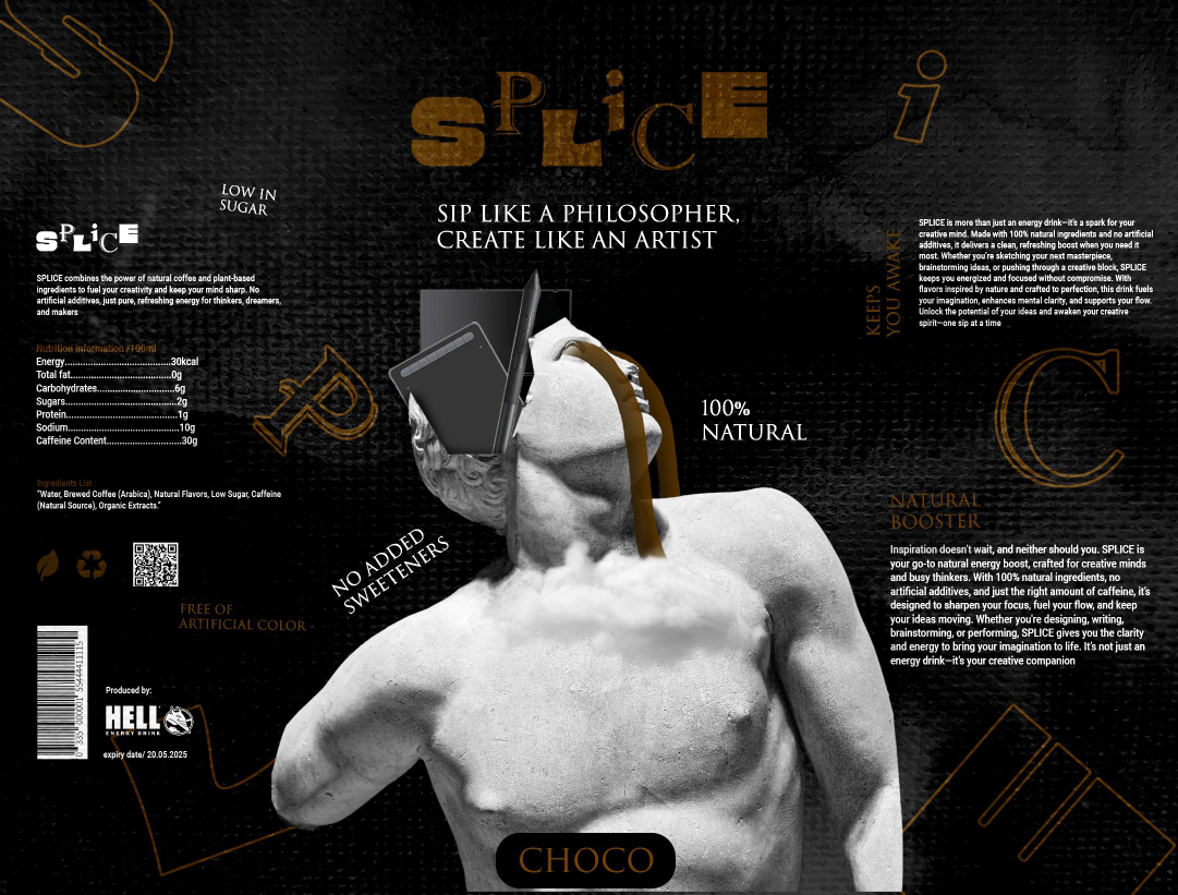
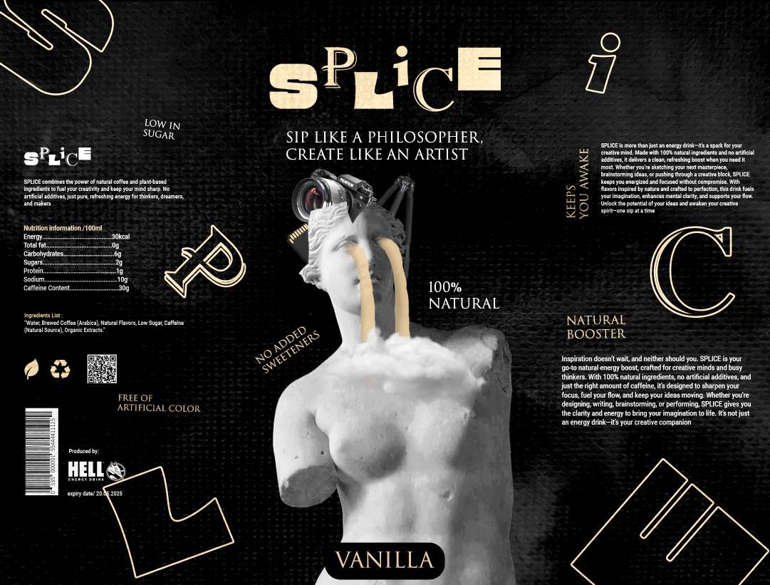
I developed a minimalist yet energetic visual identity based on the contrast between typography and graphic elements. The focus was on a clear information hierarchy and a distinctive coffee-flavored color palette. The packaging design was conceived as part of a broader system that can be expanded across different flavors and promotional materials.
Result:
The outcome is a modern and distinctive brand with strong potential for expansion through additional products and marketing campaigns.