Problem:
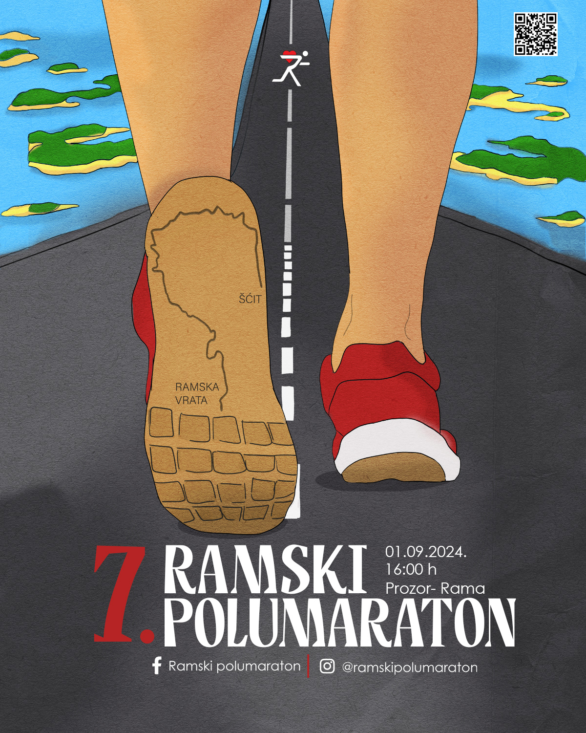
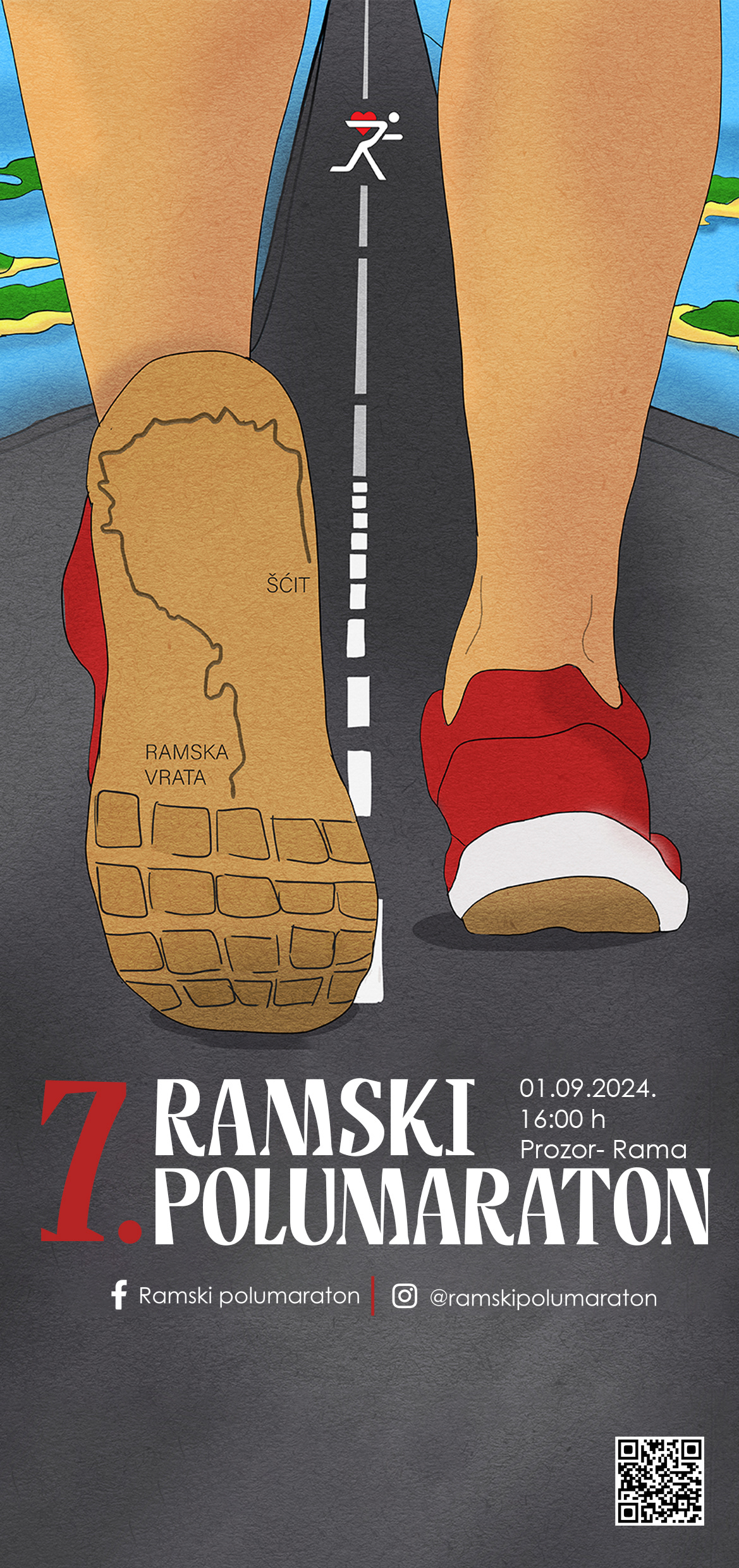
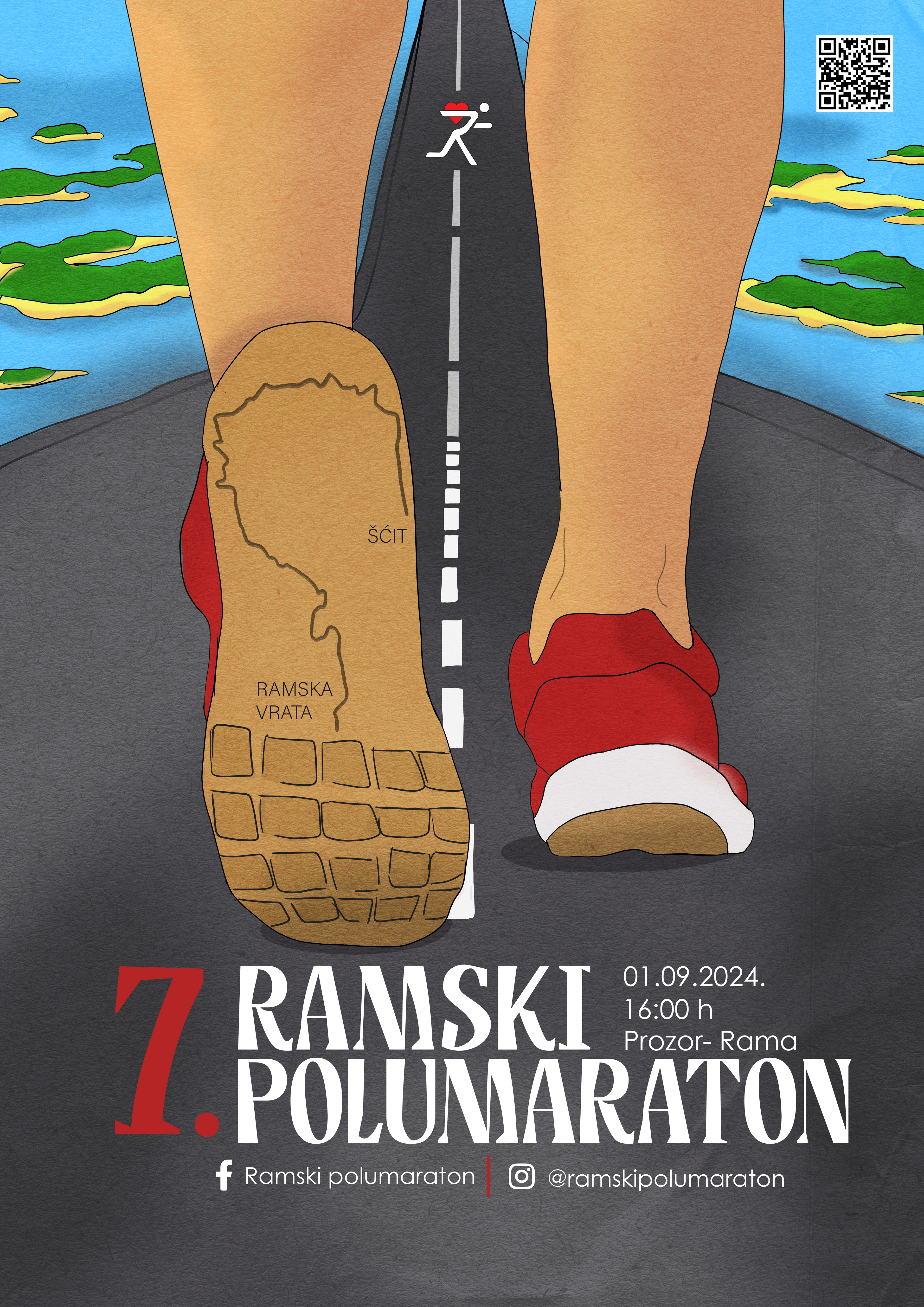
Sporting events often rely on generic visual elements that fail to reflect the uniqueness of the location and the character of the event. The task was to create an identity that communicates both the dynamism of running and the local context.
Solution:
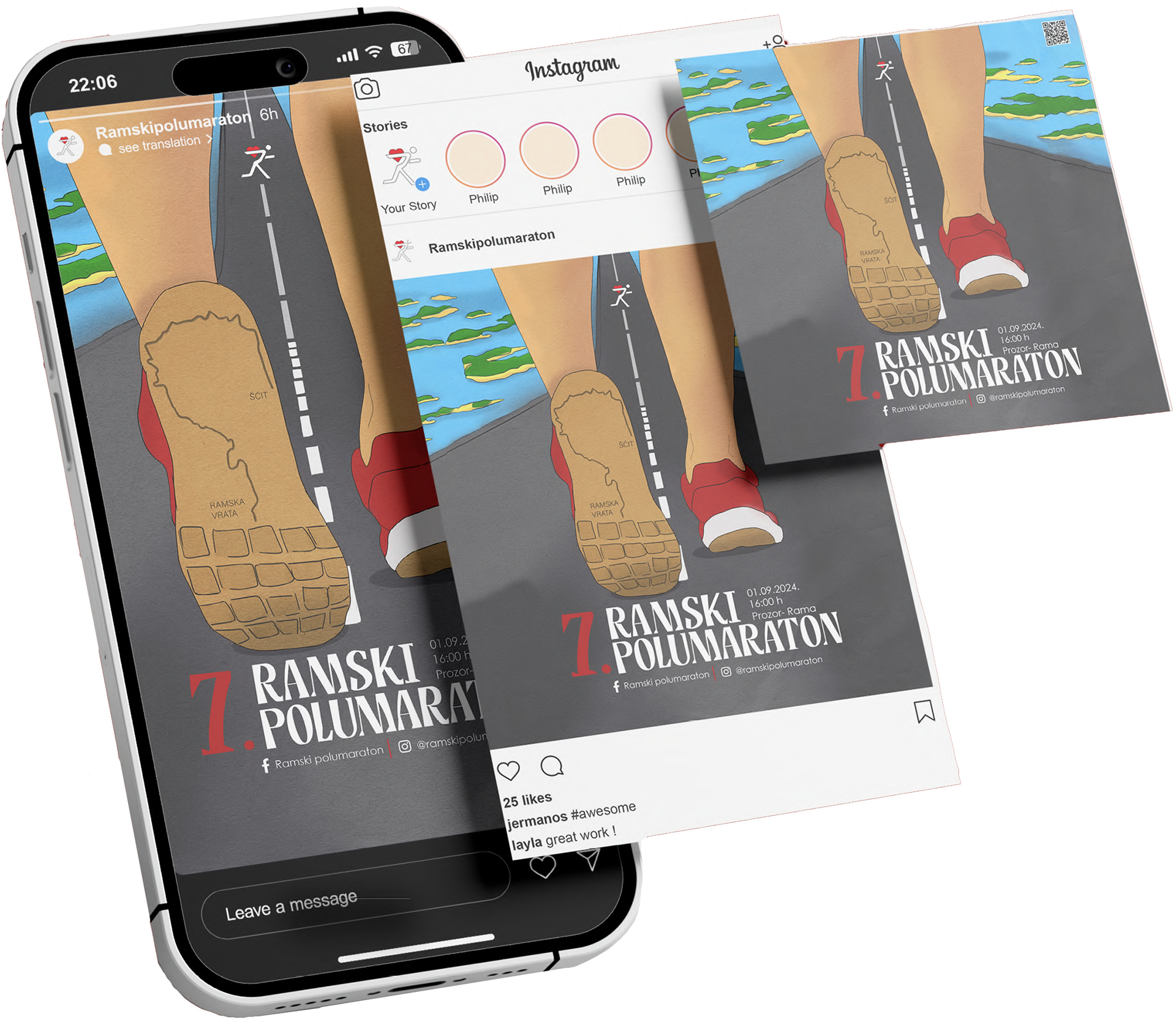
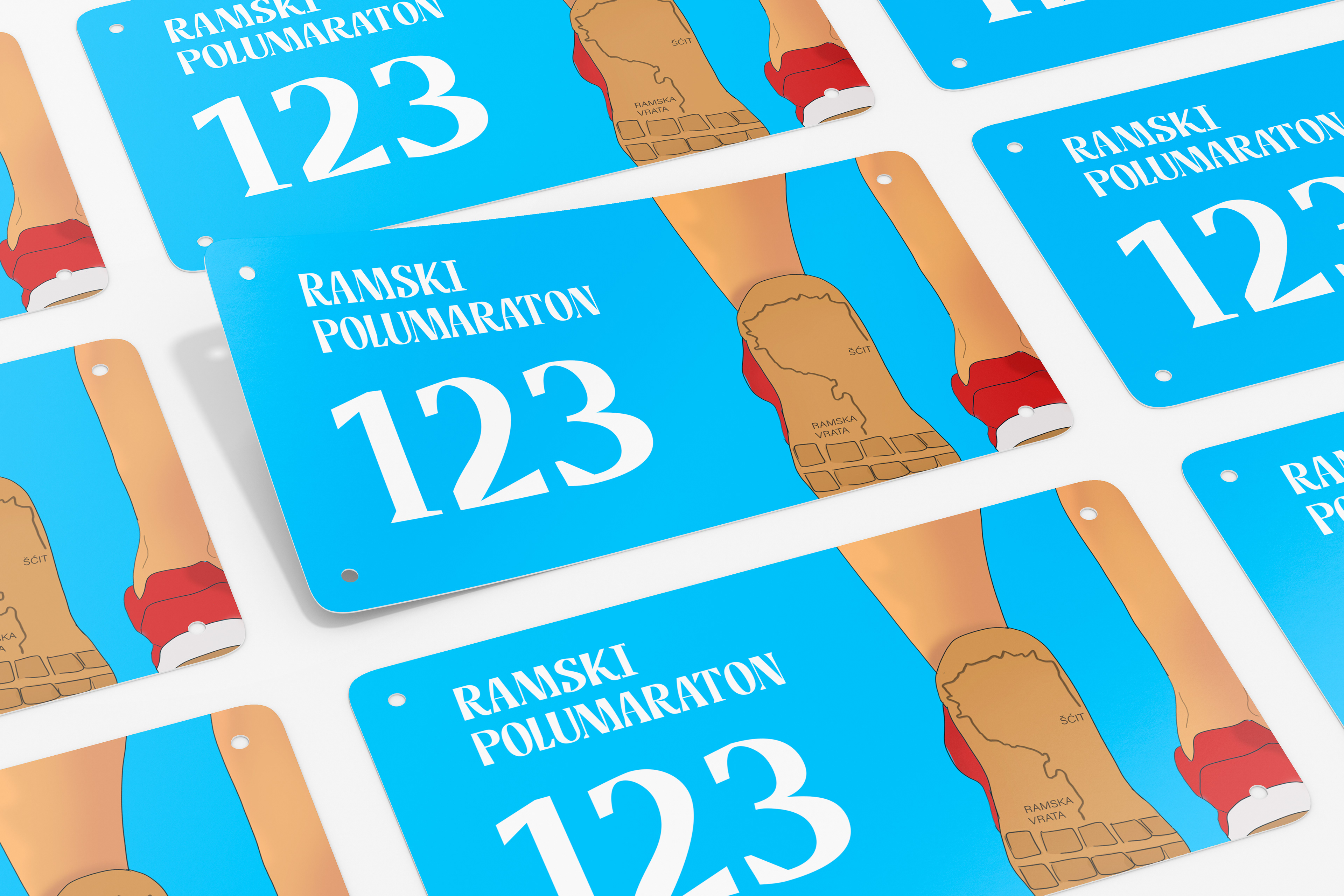
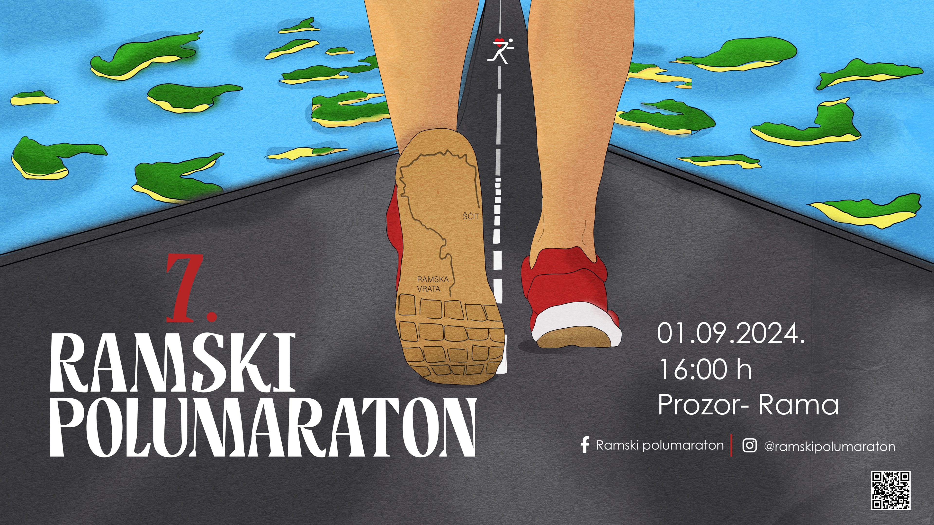
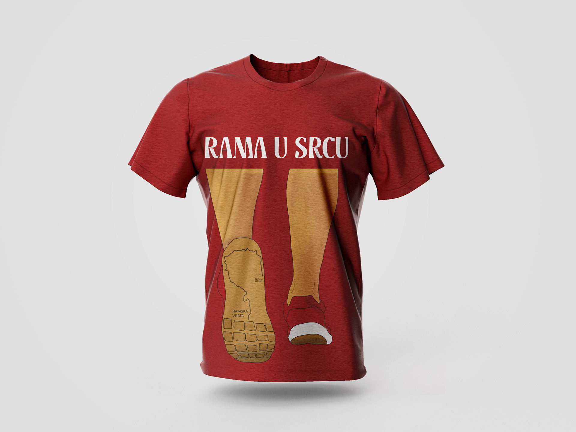
I developed a visual system that combines typographic clarity with graphic elements inspired by movement and the terrain’s topography. The system is adaptable across race bibs, medals, promotional posters, and digital content. Special attention was given to maintaining consistency throughout all applications.
Result:
The final identity captures the energy of a sporting event while maintaining a clear and professional visual character.