
Problem:
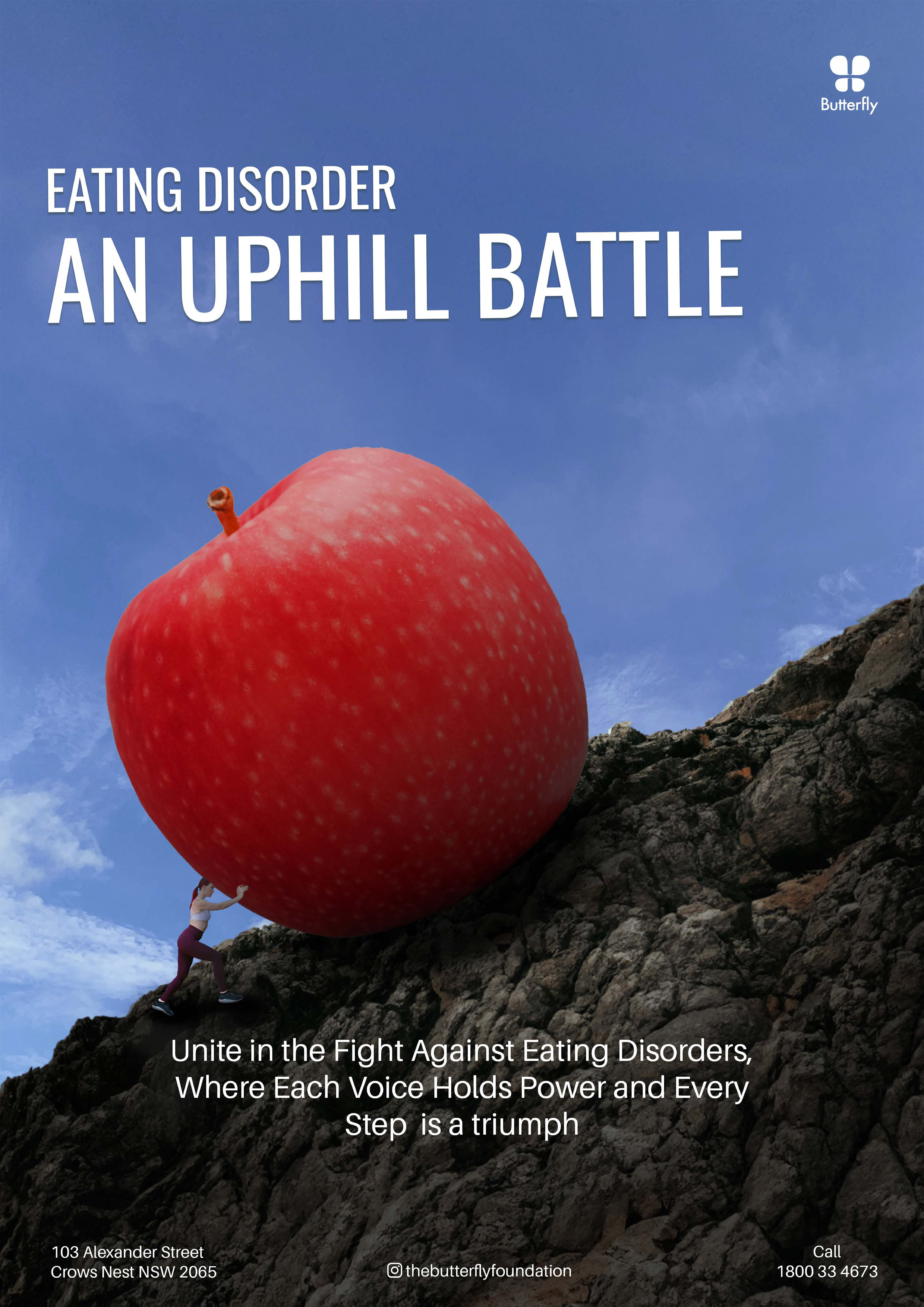
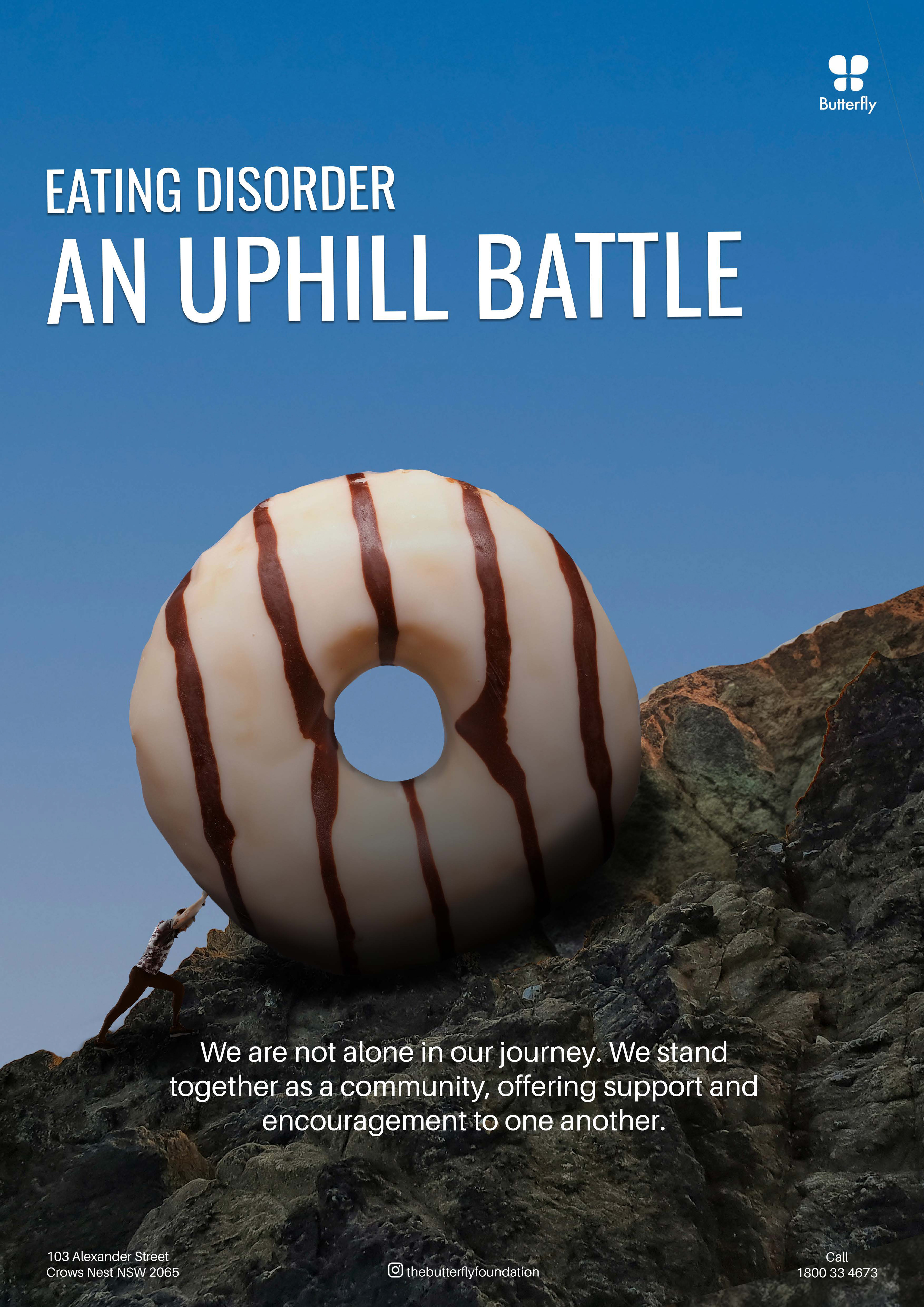
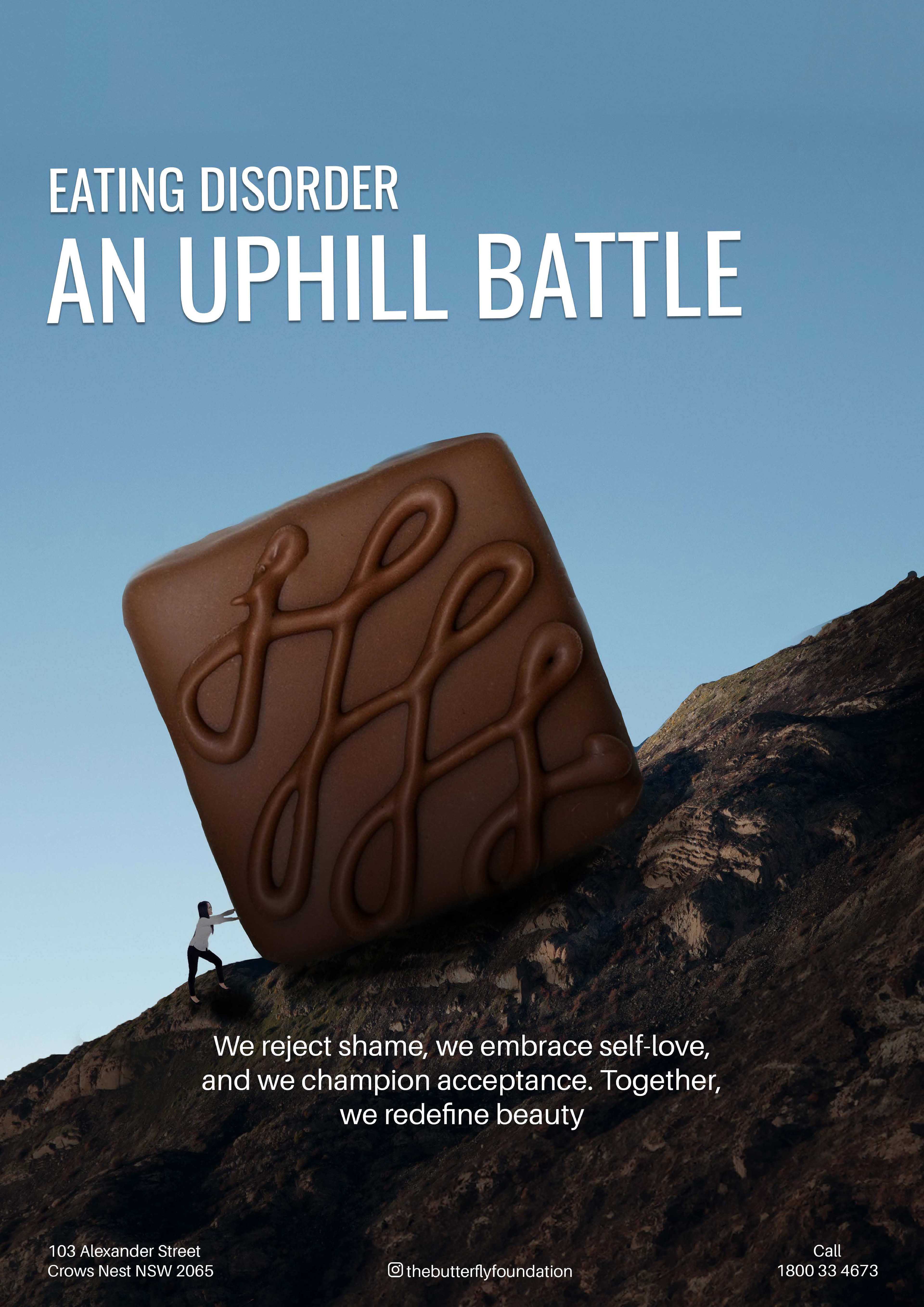
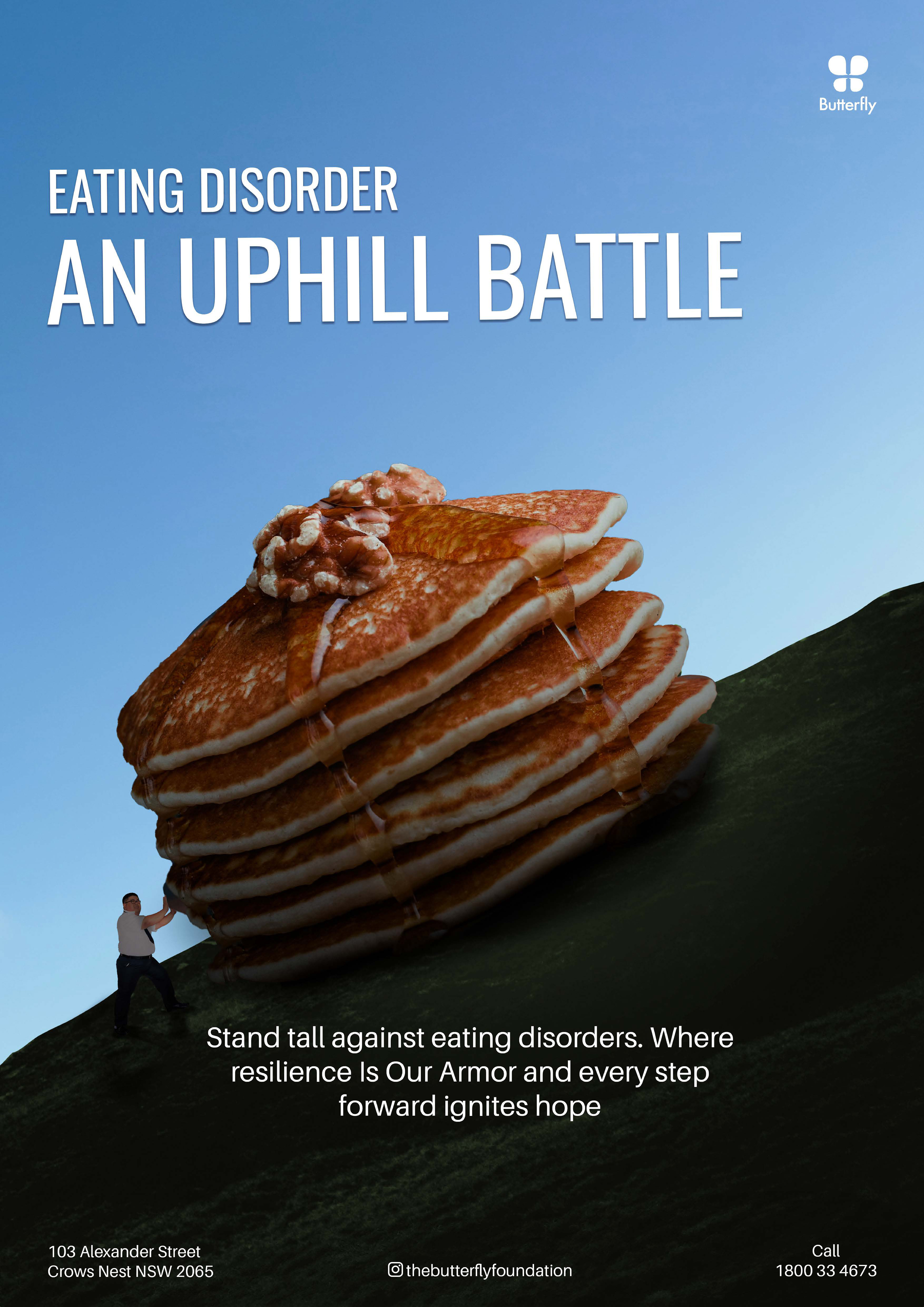
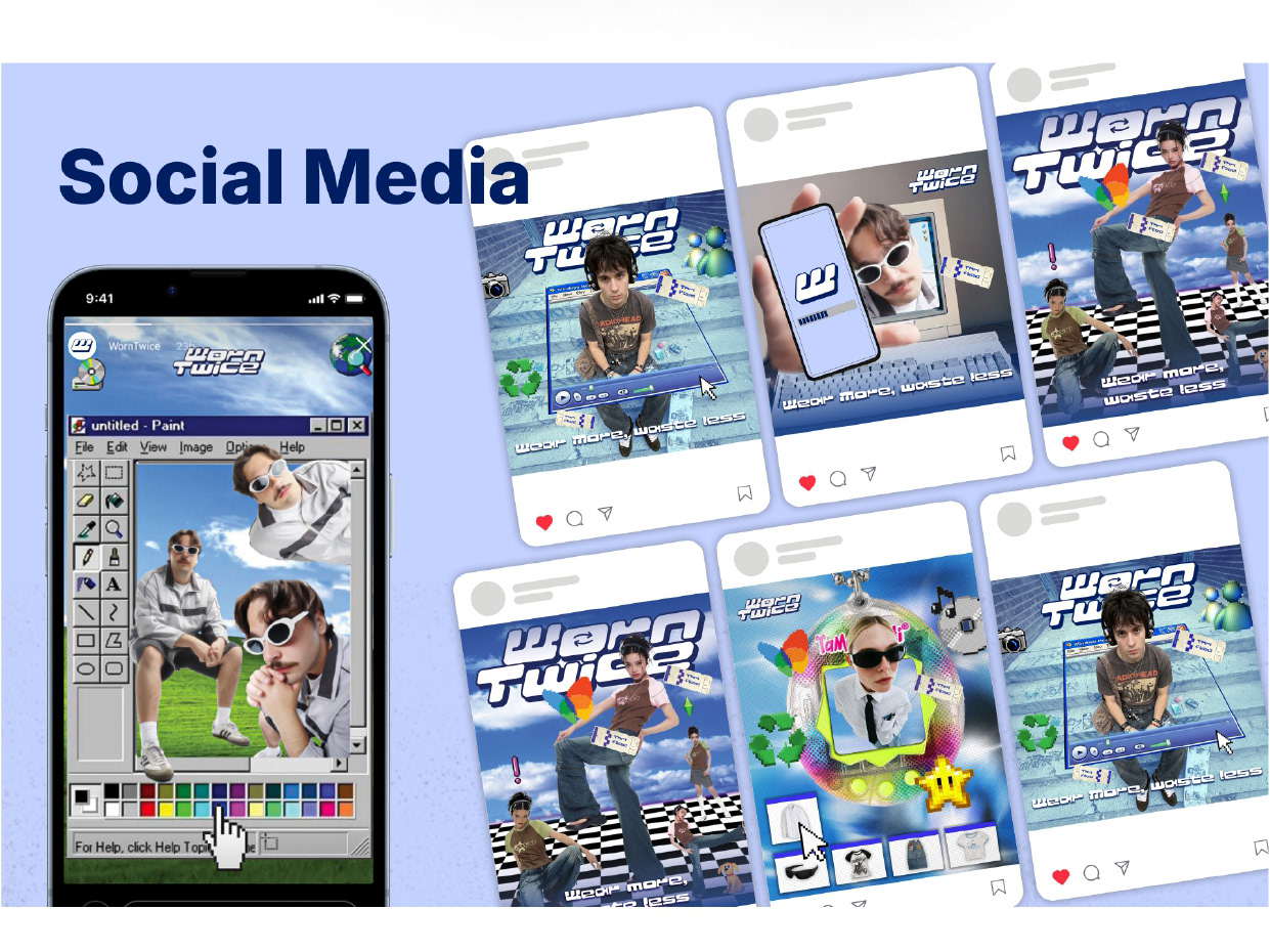
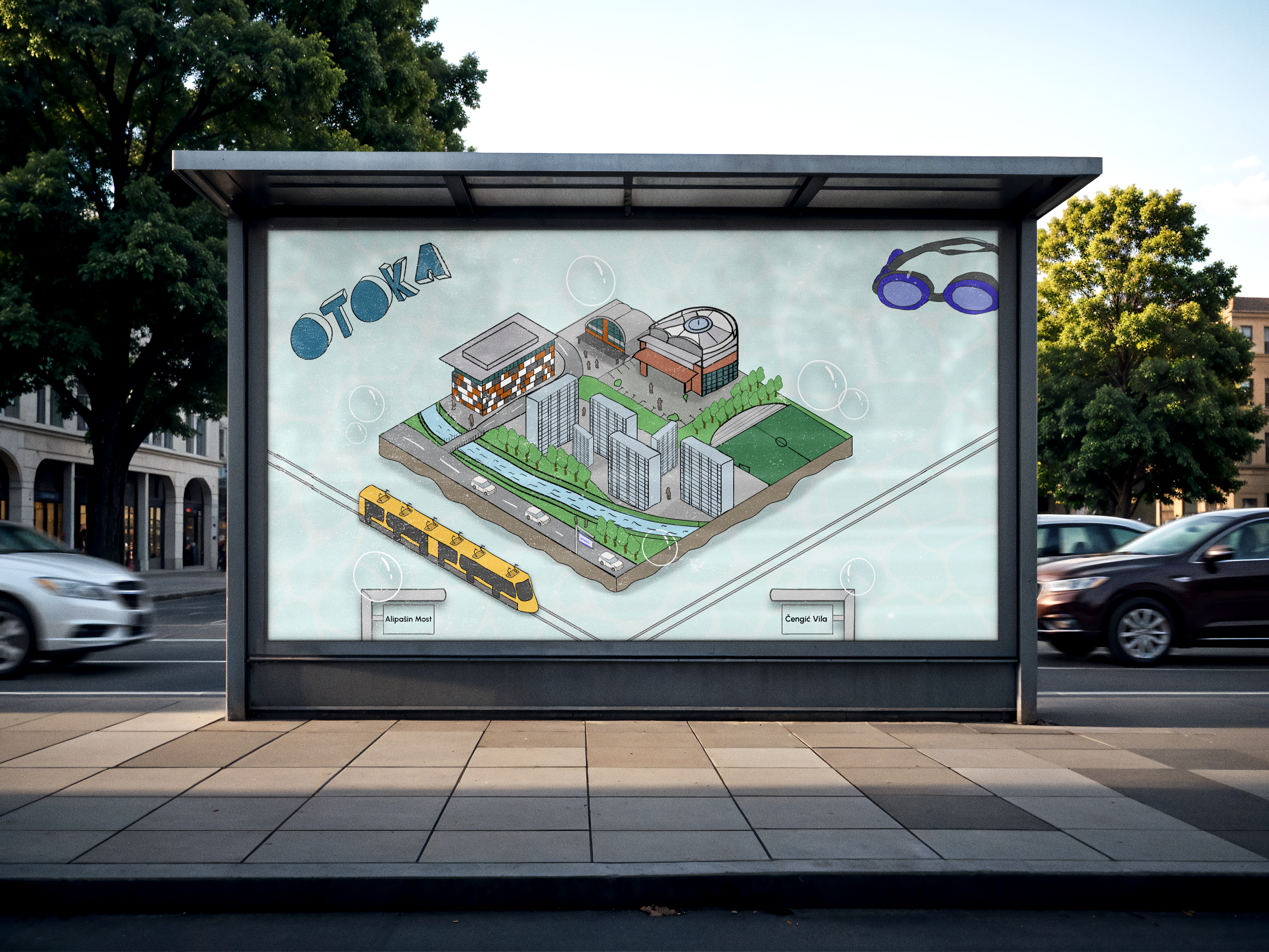
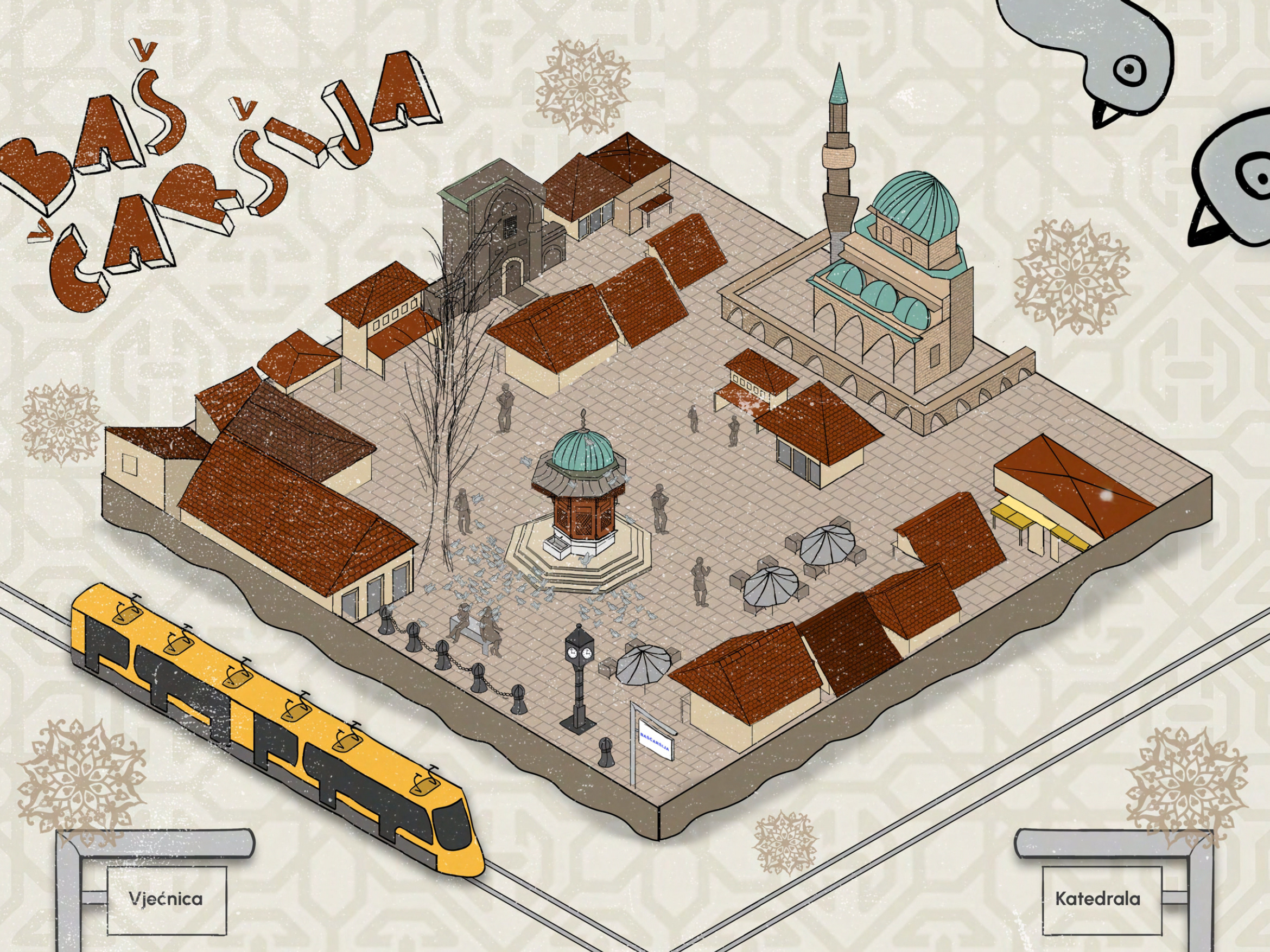
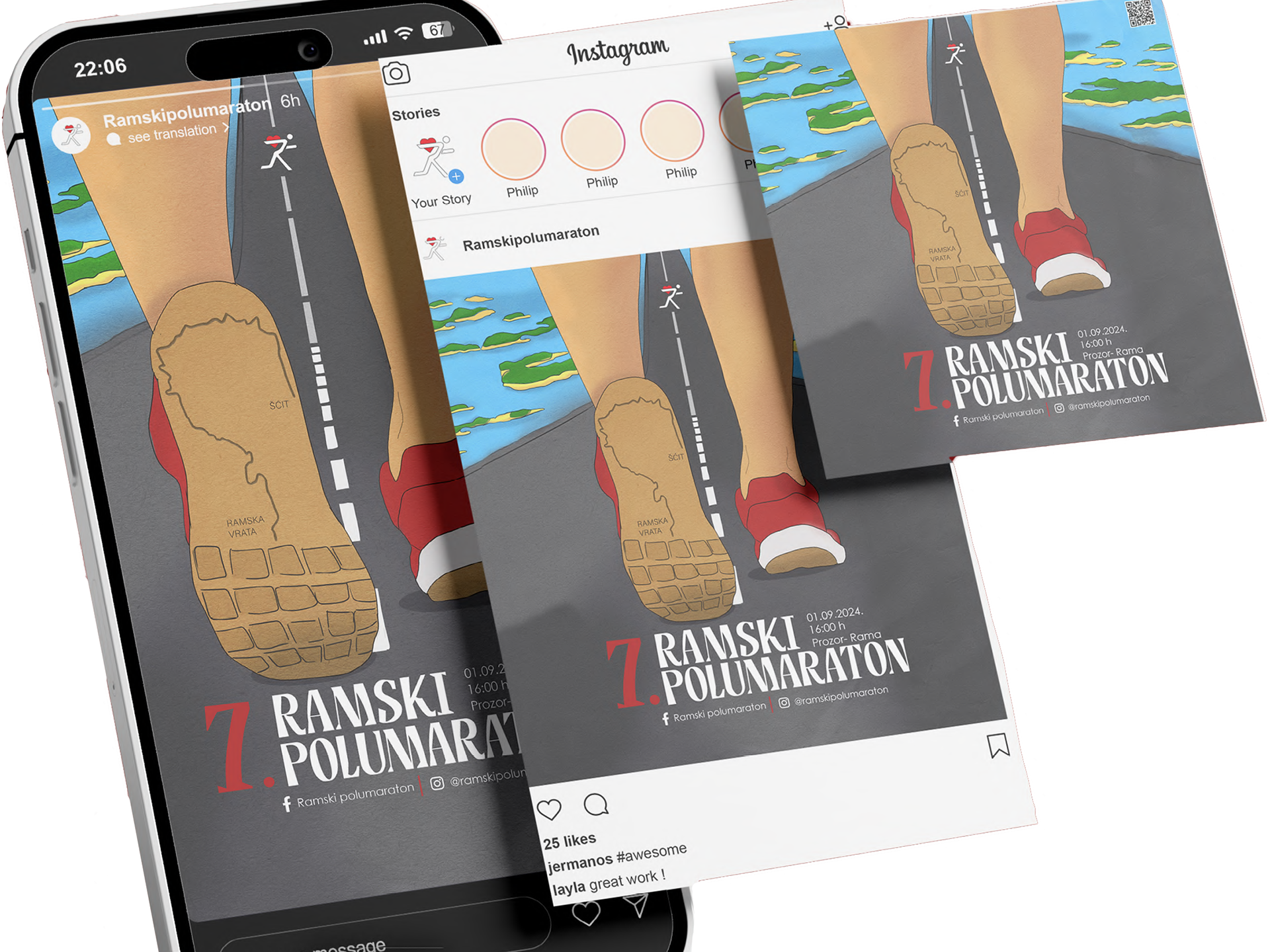
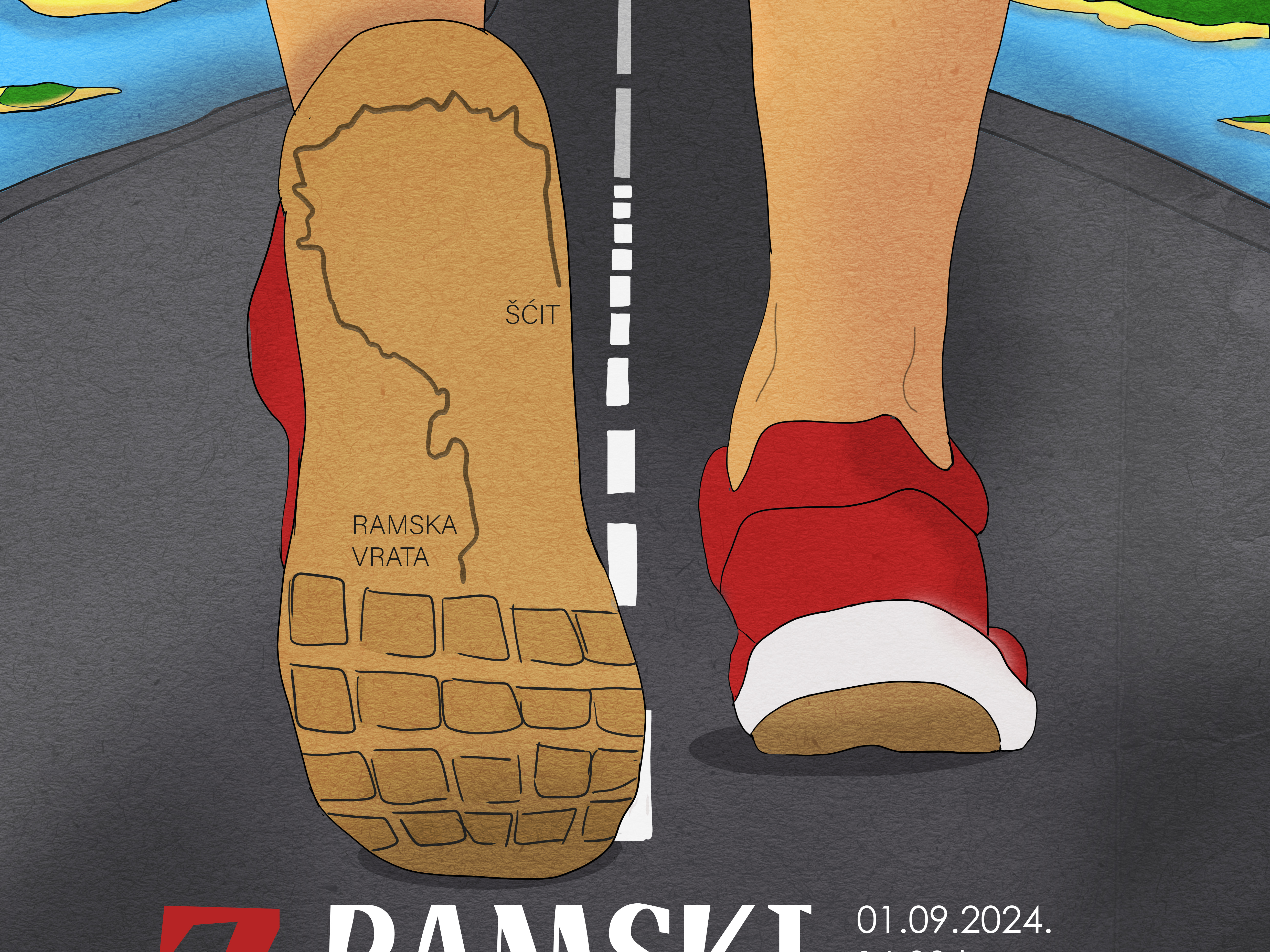
As a medium, posters require a clear visual message within a limited space. The challenge was to develop a series of works focused on a social issue. The goal was to communicate the message visually through composition and typography without relying on complex systems.
Solution:
Through the controlled use of typography and strong composition, the focus was placed on visual balance and information hierarchy. Each poster explores a different approach while maintaining a consistent graphic style.
Result:
The series demonstrates an experimental approach while also showing an understanding of fundamental graphic design principles such as rhythm, contrast, and typographic structure.